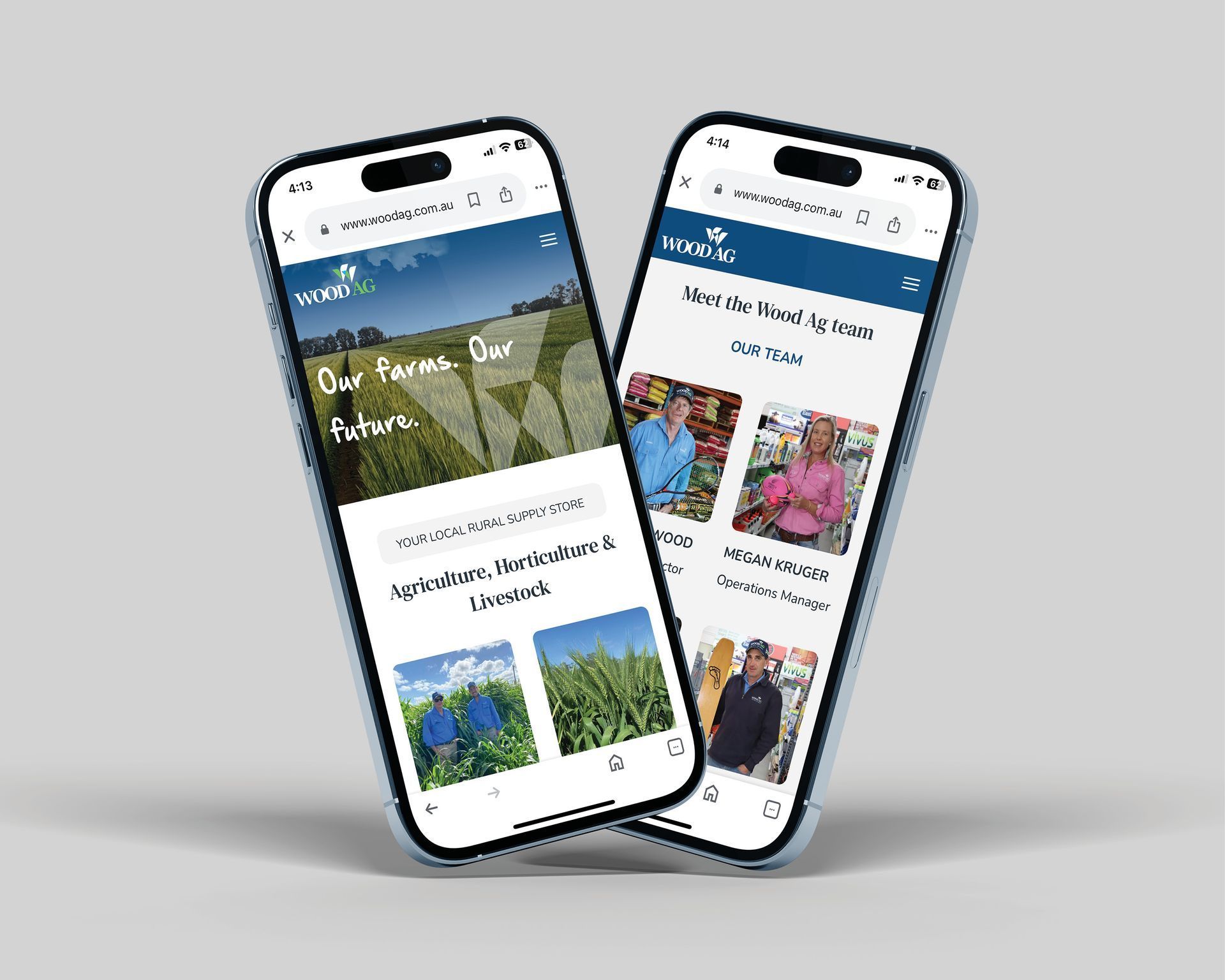
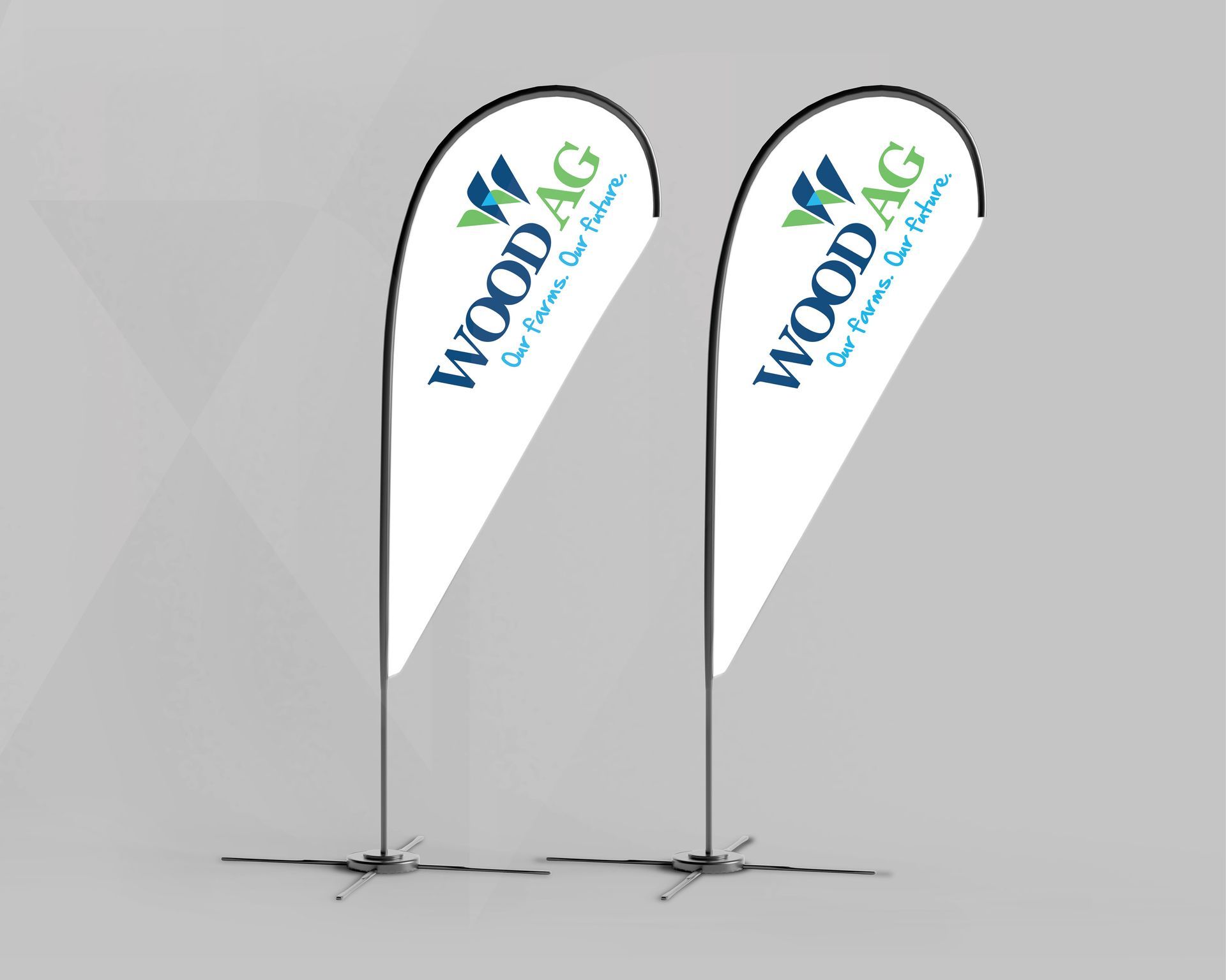
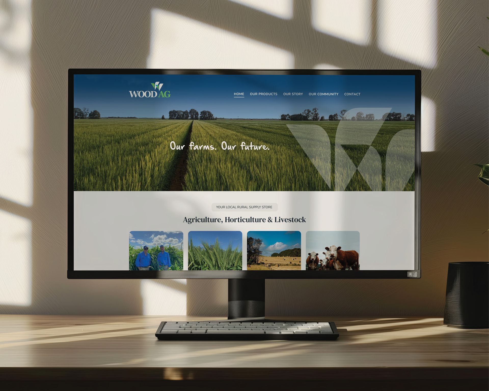
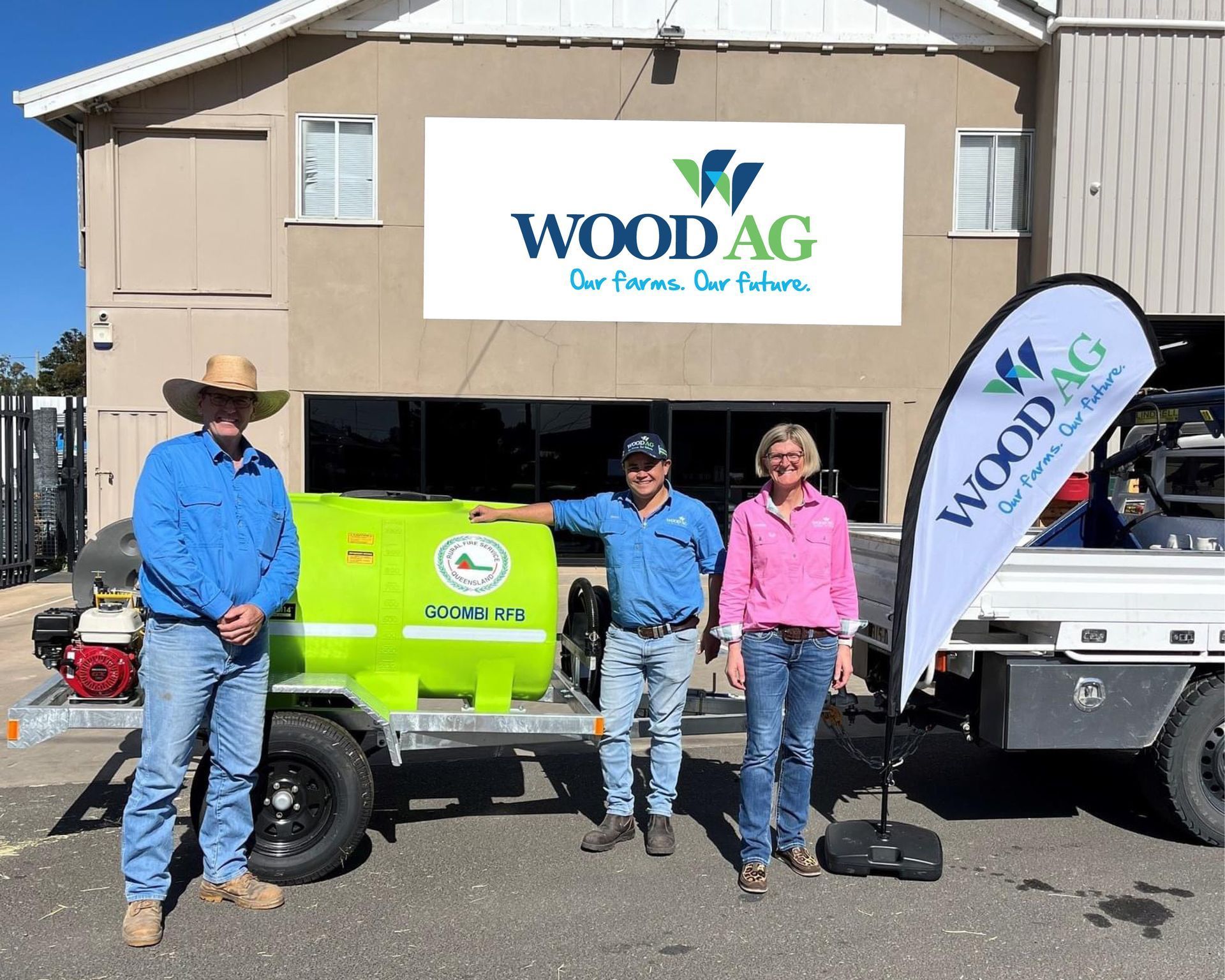
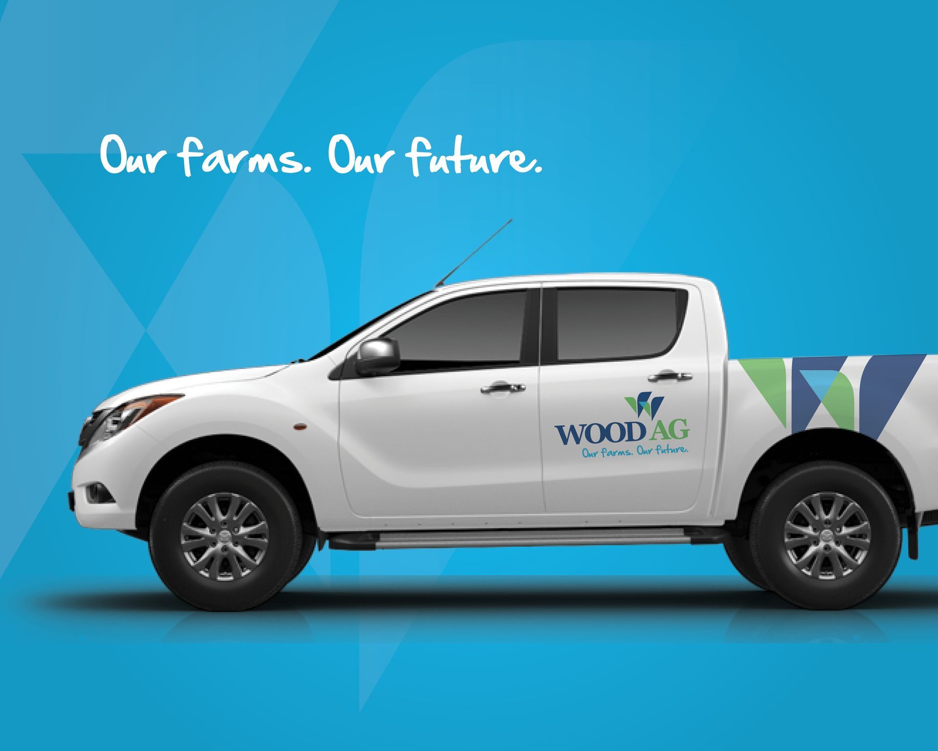
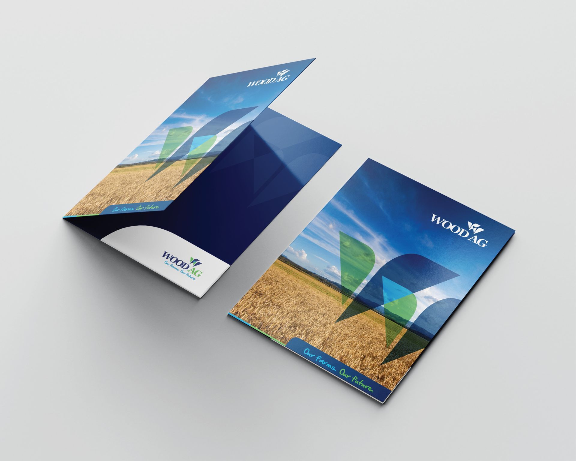
The Wood Ag logo features abstract seedling shapes forming a ‘W,’ symbolising growth and dedication to the Chinchilla farming community. As the region's leading rural supply store, Wood Ag serves agricultural, horticultural, and livestock producers, and has become a cornerstone of the local community. The serif typeface in the logo conveys tradition and expertise, while the handwritten tagline adds a personal touch. Wood Ag is a trusted source for quality agronomic advice, on-farm delivery, and offers a diverse range of general merchandise.