QBUS
Logo Design | Branding | Website
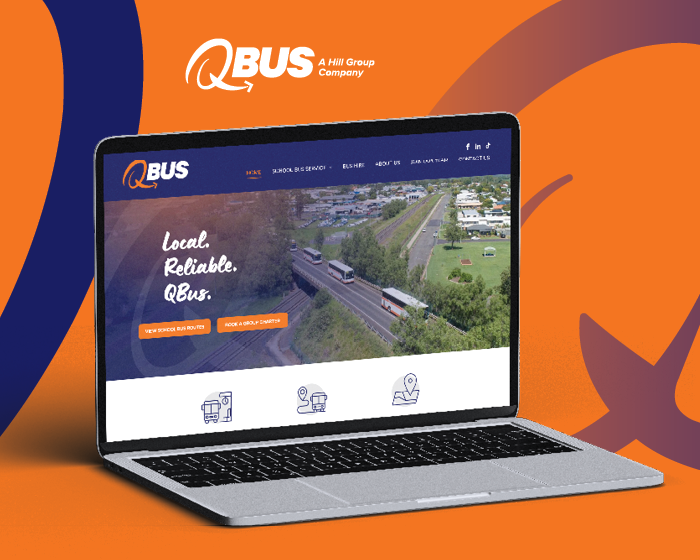
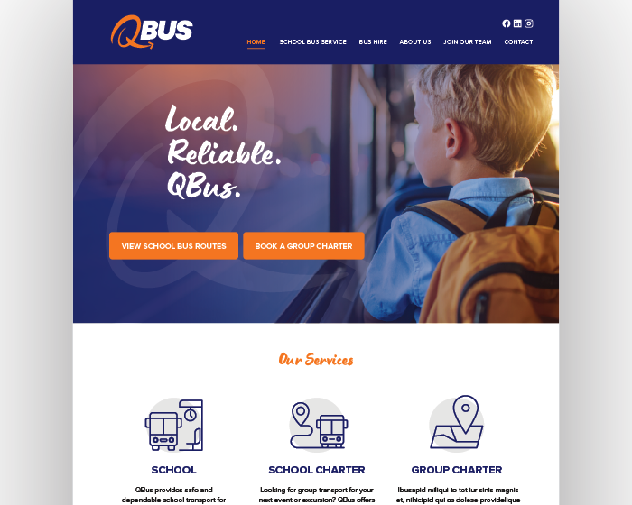
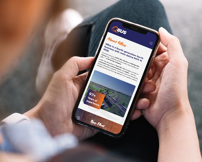
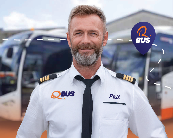
With a proud history spanning nearly 100 years, QBus partnered with Black Canvas to refresh its brand identity and digital presence while respecting its strong heritage. At the centre of the rebrand is a new logo that balances tradition with forward momentum. The hand-drawn “Q”, formed as a loop with an arrow, represents movement, direction and progress, reflecting QBus’ role in safely and reliably moving people forward. The organic form introduces a human, approachable quality, while the bold, italicised “BUS” typography adds strength and confidence. A refined orange and navy colour palette modernises the brand while reinforcing trust, professionalism and legacy.
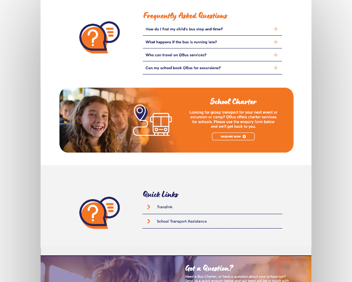
The rebrand was extended into a contemporary, user-friendly website that clearly communicates services and strengthens brand consistency across all touchpoints. Simplified navigation and a cohesive design system improve clarity and usability, while ensuring the brand translates seamlessly across digital, print, signage, uniforms and vehicle applications. The result is a future-ready brand and website that provide ease of rollout, long-term consistency and a confident platform for ongoing growth.
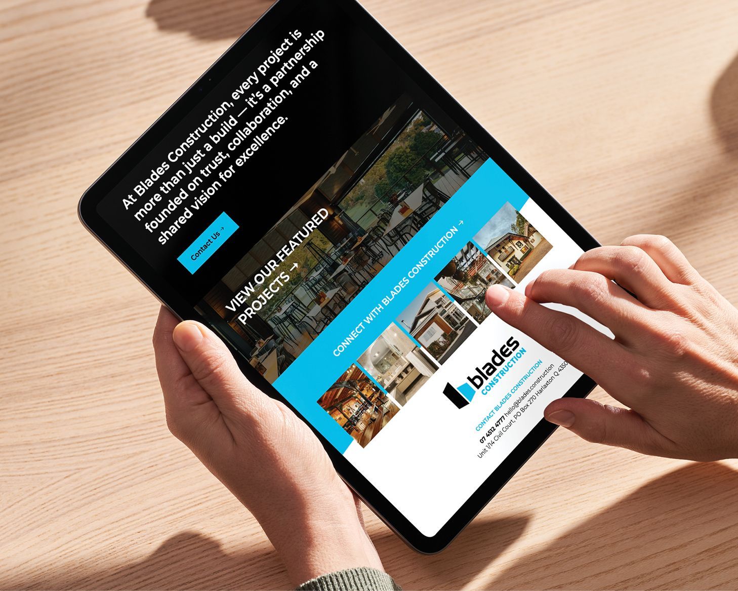
What Black Canvas did
Logo design | branding | Website design and development

Brief us.
Have a project your want to talk about? We would love the opportunity for Black Canvas to develop your new identity and help take your business to new heights.
Contact Us
Thank you for contacting us!
We will get back to you as soon as possible.
Oops, there was an error sending your message. Please try again later.