Bright Arc Electrical
Logo Design | Branding
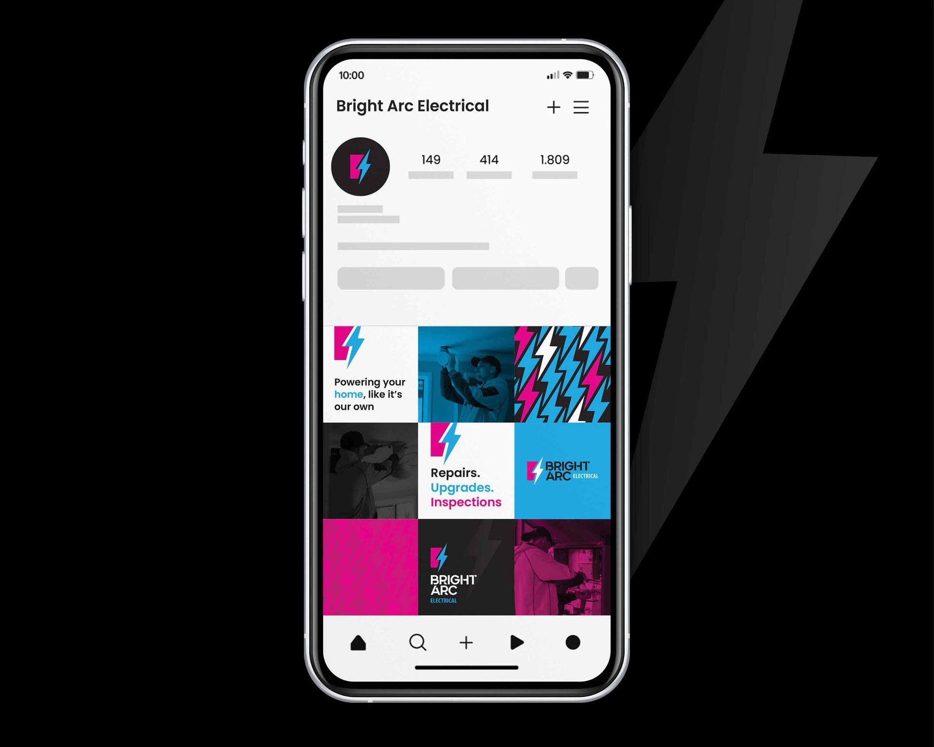
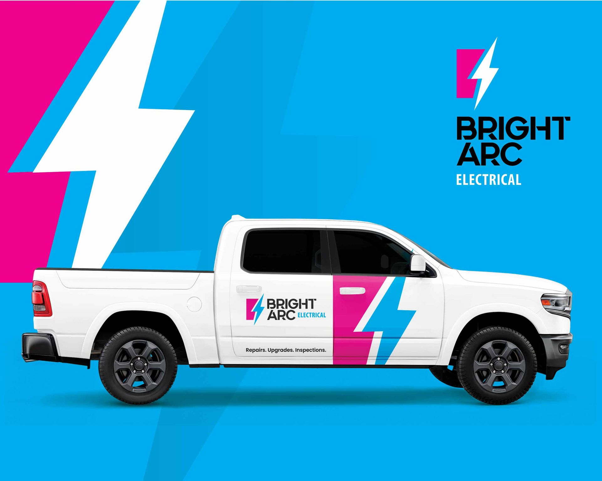
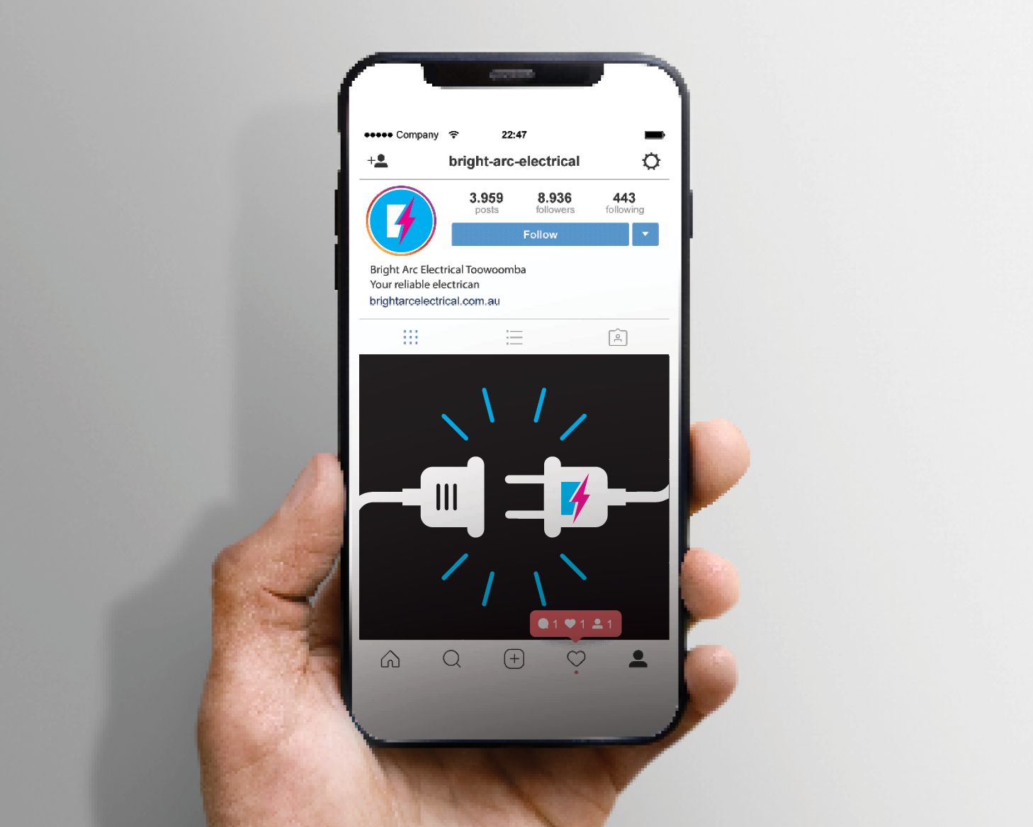
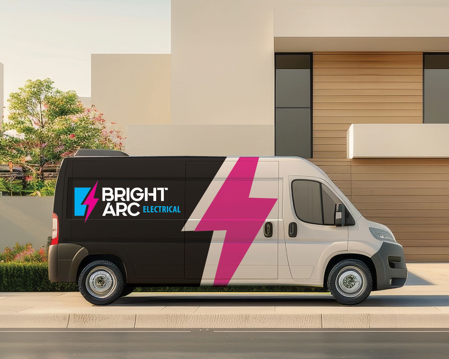
Bright Arc Electrical partnered with Black Canvas to create a bold, contemporary logo and brand identity that clearly communicates energy, professionalism and confidence. The logo symbol is formed from a solid block intersected by a lightning bolt — a universal symbol of electricity and power. This interaction creates a stylised “B”, providing a strong visual cue that makes the brand easily recognisable and memorable.
A modern, uppercase sans serif typeface with subtle cut-out details reflects the angular forms of the symbol, creating cohesion across the identity. The cyan blue and magenta colour palette, anchored by black, delivers a striking and energetic presence while maintaining a professional edge. Together, the logo and branding establish a confident, future-focused identity that positions Bright Arc Electrical as a bold and reliable electrical services provider, with a versatile system designed for consistent rollout across signage, vehicles, uniforms and marketing materials.
What Black Canvas did
Logo design | Branding | Business card
Brief us.
Have a project your want to talk about? We would love the opportunity for Black Canvas to develop your new identity and help take your business to new heights.
Contact Us
Thank you for contacting us!
We will get back to you as soon as possible.
Oops, there was an error sending your message. Please try again later.